How to Quickly Implement Beautiful Charts in Your Android App
People mostly perceive information visually: videos, photos, and charts draw attention and explain things better than plain numbers or words. This is why many applications use bright and clear charts to present information. In this article, we explore how to add charts to your app without spending lots of time (and therefore money) on their development.
Why and where should you use charts?
Charts have become an extremely popular element of modern UI design in mobile applications. There are lots of ways you can use them for your Android app development, and there are even more ways you can make your charts sleek and beautiful.
Charts have benefits that make this way of presenting information one of the best:
- Visual — According to multiple studies, people perceive visual information much better than any other kind of information. For example, a study by researchers at the University of Minnesota showed that people process visuals 60,000 times faster than text. This means that adding a chart to your mobile app will make information clearer and therefore improve the user experience.
- Optimize space — A chart can also be a compact way to present information. Instead of using tables, just implement charts and free screen space.
You can use charts to display lots of information. For example, Apple uses charts in the Apple Watch to show fitness information.
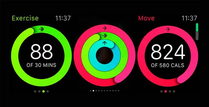
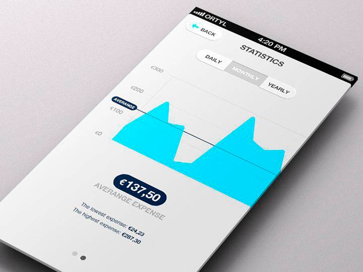
You can also use charts in a banking app or an app for managing personal finances to show spending and income:
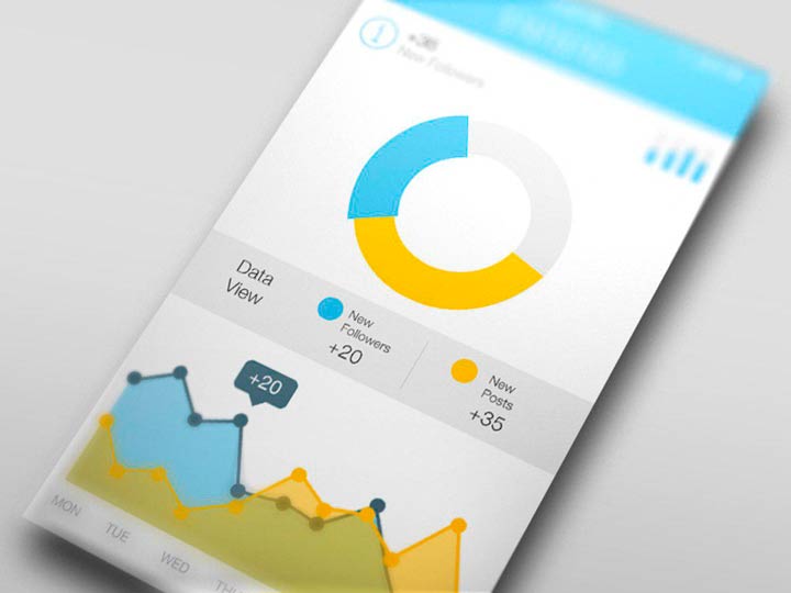
Charts can be used in apps for mobile analytics and marketing:
And there are countless cases where you can use charts in your mobile app. These types of applications often use charts:
- Banking and personal finance
- Fitness and nutrition
- Analytics
- Logistics
- Social media
- Battery management
- Time management
- Internet of Things
- Business and management
You can find lots of creative ways to use charts in other types of mobile applications as well.
Now let’s talk about how to implement a chart in your mobile application and not spend lots of development hours on it.
A simple solution for your app
Creating a chart using graphics can take lots of time, prolonging development and increasing costs. To avoid this, you can use an open source library to create charts. There are already lots of them online, and you can choose any. In this article we’ll look at MPAndroidChart by Phil Jay. It’s new in comparison to other chart libraries, and I like it because it’s stable. Over 3,000 users on GitHub agree with me. With this library, you can create different kinds of customizable charts without much effort. You can also add animations and customize them.
Now I’ll show you how to draw charts on Android with this library. In this article we’ll focus on a simple bar chart with animation, but first let’s explore what types of charts are available in this library.
MPAndroidChart Library
All you need to know about MPAndroidChart is that it’s one of the simplest ways to add charts to your app and that it works on Android API 8 and above. If you want to use animations, you’ll need API 11 or above.
Animations are a core element of modern mobile app UIs, which is why it’s such a great thing to have them in this library. You’ll find over 25 built-in animations, but if you want something special you can also add custom ones. So what can you actually build with MPAndroidChart?
- Simple bar chart
- Grouped bar chart
- Horizontal bar chart
- Simple line chart
- Line chart with cubic lines
- Grouped line chart
- Combined line and bar chart
- Pie chart
- Scatter chart
- Candlestick chart
- Radar chart
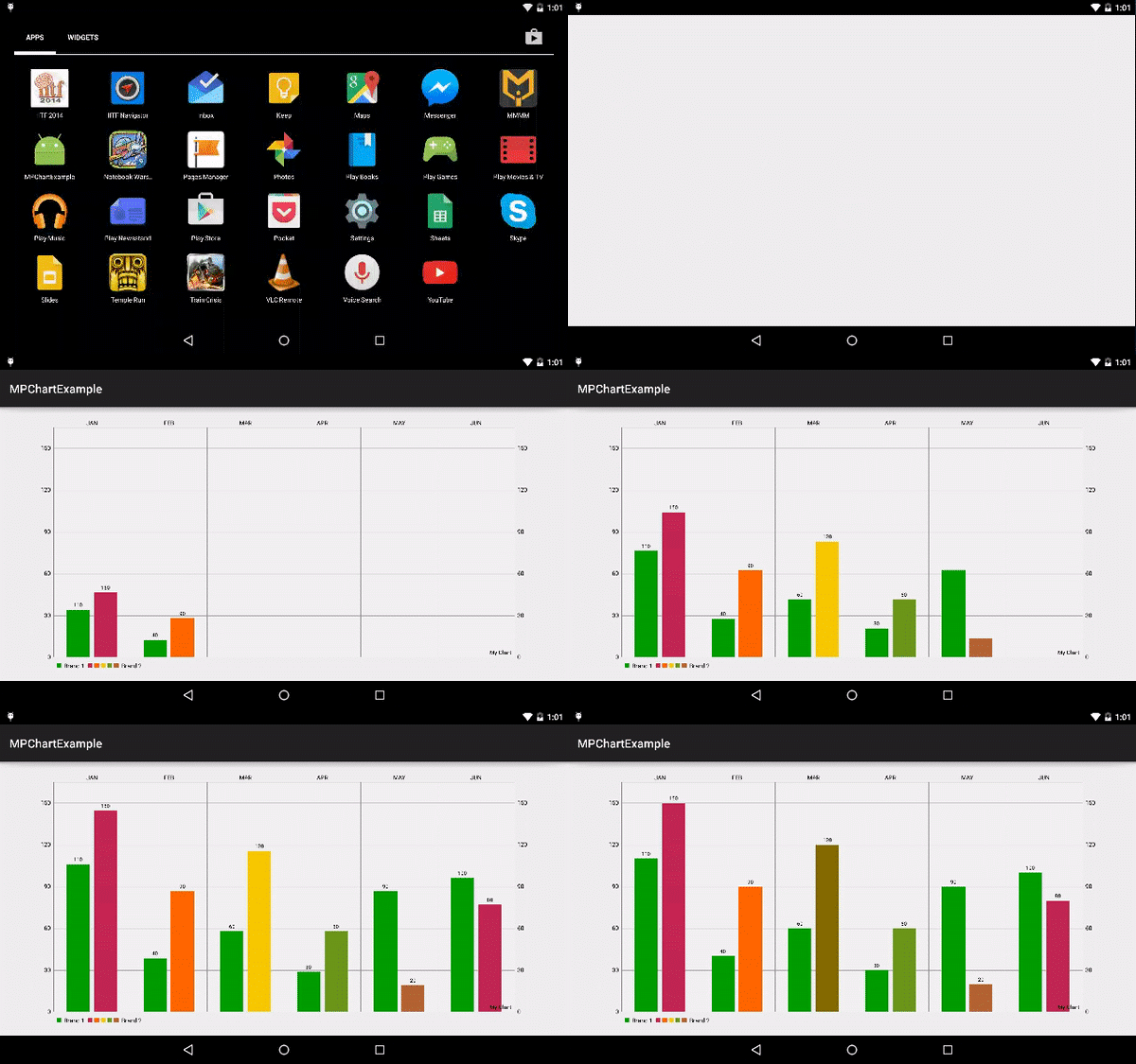
In this tutorial, we’ll build a grouped bar chart with an animation like the one shown here:
How to integrate an animated chart step by step
Step 1
To start, first add these lines to your gradle file:
build.gradle (app)

repositories {
    maven { url "https://jitpack.io" }
}
dependencies {
    implementation 'com.github.PhilJay:MPAndroidChart:v3.0.3'
}
Step 2
Create a layout for your MPAndroidChart:
activity_main.xml

<RelativeLayout xmlns:android="http://schemas.android.com/apk/res/android"
                xmlns:tools="http://schemas.android.com/tools"
                android:layout_width="match_parent"
                android:layout_height="match_parent"
                android:paddingLeft="@dimen/activity_horizontal_margin"
                android:paddingRight="@dimen/activity_horizontal_margin"
                android:paddingTop="@dimen/activity_vertical_margin"
                android:paddingBottom="@dimen/activity_vertical_margin"
                tools:context=".MainActivity">

    <com.github.mikephil.charting.charts.BarChart
        android:id="@+id/chart"
        android:layout_width="match_parent"
        android:layout_height="match_parent" />

</RelativeLayout>
As you can see in the above layout, I’ve used the com.github.mikephil.charting.charts.BarChart xml tag to create an Android bar chart.
Step 3
Now have a look at the activity code:
MainActivity.java
Java


package com.truiton.mpchartexample;

import android.graphics.Color;
import android.os.Bundle;
import android.support.v7.app.ActionBarActivity;

import com.github.mikephil.charting.charts.BarChart;
import com.github.mikephil.charting.data.BarData;
import com.github.mikephil.charting.data.BarDataSet;
import com.github.mikephil.charting.data.BarEntry;
import com.github.mikephil.charting.utils.ColorTemplate;

import java.util.ArrayList;

public class MainActivity extends ActionBarActivity {

    @Override
    protected void onCreate(Bundle savedInstanceState) {
        super.onCreate(savedInstanceState);
        setContentView(R.layout.activity_main);
        BarChart chart = (BarChart) findViewById(R.id.chart);

        BarData data = new BarData(getXAxisValues(), getDataSet());
        chart.setData(data);
        chart.setDescription("My Chart");
        chart.animateXY(2000, 2000);
        chart.invalidate();
    }

    private ArrayList getDataSet() {
        ArrayList dataSets = null;

        ArrayList valueSet1 = new ArrayList<>();
        BarEntry v1e1 = new BarEntry(110.000f, 0); // Jan
        valueSet1.add(v1e1);
        BarEntry v1e2 = new BarEntry(40.000f, 1); // Feb
        valueSet1.add(v1e2);
        BarEntry v1e3 = new BarEntry(60.000f, 2); // Mar
        valueSet1.add(v1e3);
        BarEntry v1e4 = new BarEntry(30.000f, 3); // Apr
        valueSet1.add(v1e4);
        BarEntry v1e5 = new BarEntry(90.000f, 4); // May
        valueSet1.add(v1e5);
        BarEntry v1e6 = new BarEntry(100.000f, 5); // Jun
        valueSet1.add(v1e6);

        ArrayList valueSet2 = new ArrayList<>();
        BarEntry v2e1 = new BarEntry(150.000f, 0); // Jan
        valueSet2.add(v2e1);
        BarEntry v2e2 = new BarEntry(90.000f, 1); // Feb
        valueSet2.add(v2e2);
        BarEntry v2e3 = new BarEntry(120.000f, 2); // Mar
        valueSet2.add(v2e3);
        BarEntry v2e4 = new BarEntry(60.000f, 3); // Apr
        valueSet2.add(v2e4);
        BarEntry v2e5 = new BarEntry(20.000f, 4); // May
        valueSet2.add(v2e5);
        BarEntry v2e6 = new BarEntry(80.000f, 5); // Jun
        valueSet2.add(v2e6);

        BarDataSet barDataSet1 = new BarDataSet(valueSet1, "Brand 1");
        barDataSet1.setColor(Color.rgb(0, 155, 0));
        BarDataSet barDataSet2 = new BarDataSet(valueSet2, "Brand 2");
        barDataSet2.setColors(ColorTemplate.COLORFUL_COLORS);

        dataSets = new ArrayList<>();
        dataSets.add(barDataSet1);
        dataSets.add(barDataSet2);
        return dataSets;
    }

    private ArrayList getXAxisValues() {
        ArrayList xAxis = new ArrayList<>();
        xAxis.add("JAN");
        xAxis.add("FEB");
        xAxis.add("MAR");
        xAxis.add("APR");
        xAxis.add("MAY");
        xAxis.add("JUN");
        return xAxis;
    }
}
This will result in a great-looking bar chart like this:
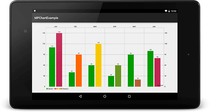
Let me explain how the MPAndroidChart library works. As shown in the class above, first a BarChart is initialized. Then data is generated according to the bar chart with the help of the BarEntry class. This is a subclass of the Entry class, which is the base class for all chart data types in the MPAndroidChart library.
Further, this BarEntry is added into BarDataSet. Then all of these values along with X-axis values are set in the bar chart using the chart.setData(data) method. Now to make the bar chart reflect this latest data, we need to call chart.invalidate()method. This will result in the great-looking bar chart shown above.
As I’ve mentioned, the MPAndroidChart library is customizable. Let’s have a look at some of its key features.
MPAndroidChart animations
To animate a chart from the MPAndroidChart library, these methods are used:
- chart.animateX(2000) – For X-axis animation
- chart.animateY(2000) – For Y-axis animation
- chart.animateXY(2000, 2000) – For XY-axis animation
The above code will add a standard animation. But if you wish to change the animation style or want to make a custom animation, refer to this page. Note that animations will work only on API 11 and above.
MPAndroidChart colors
While making charts on Android using the MPAndroidChart library, you can also change the color of bars in the chart using these methods:
- setColor – Used to set a single color for a full data set
- setColors – Used to set entries in different colors within a data set
These methods are used while creating the DataSet object shown above.
Conclusion
MPAndroidChart is a great library that can help developers create beautiful, customized, and animated charts in just a few steps. In this article I showed you how to build a bar chart, but you can create all kinds of charts for your application — just change the class names. Mostly you won’t have to change anything: the MPAndroidChart library is created in such a way that in all charts you input the information in the same way.
If you have any questions on integrating or using charts in your mobile app, don’t hesitate to contact Mobindustry for a free consultation. We’ll be glad to help.

