Responsive Web Design Approach: Best Practices and Examples
In this article, we dive into the world of responsive web design and explain why it’s important. Learn responsive design best practices and find examples.
What is responsive design?
A responsive web design works across a variety of devices, responding to screen size, platform, and orientation.
Flexible grids are the fundamental building blocks of responsive design. All assets in a responsive design, such as images, adapt to different screen sizes and resolutions via CSS media queries. As a result, the user experience (UX) is excellent on any device — be it a large desktop display or the small screen of a mobile device. The site’s design automatically adapts depending on the resolution.
Components of responsive web design
It’s difficult to understand the nature of responsive design without understanding the technical side of it. Responsive websites have three defining features: responsive layouts, media queries, and flexible media.
Responsive layouts
Creating a responsive layout means creating a website layout with a responsive grid. Responsive grids are created using CSS. A web layout is made up of columns that are automatically resized to fit the screen or browser window.
Media queries
A flexible layout alone is not enough to optimize designs for different screens. When a layout gets too small, it can start to degrade and create columns that are too narrow to effectively display content. But media queries can save the day.
Ethan Marcotte defines media queries as follows: “A media query allows us to target not only certain classes of devices, but actually check the physical characteristics of the device displaying our work.”
Media queries enable web designers to create conditional checks to customize their UI/UX designs based on the properties of a user’s device. They also allow web designers to specify different styles for different browsers and devices.
Flexible images and videos
As the viewport is resized, images, videos, and other types of media should scale. All assets in a responsive design are distributed in flexible containers that resize when the user changes the browser window or switches to another device. A simple way to make media content scalable is by customizing the templates of images used in a responsive design—this will allow you to change the dimensions of an image and adapt it across various screen sizes.
A mobile-first approach to responsive design
Mobile web design means developing a mobile website first and then finalizing the desktop version. There are several reasons why this approach works well.
- Mobile websites have more usability issues (mainly due to a lack of screen space), so it’s more practical and efficient to focus on mobile design.
- Scaling up the mobile version is easier than shrinking the desktop version.
- Mobile-focused web design helps to redefine what’s needed visually and functionally.
Designing a mobile-friendly website forces designers to ask a number of important questions, as there is less room to work on the screen.
- Is this feature/function really necessary?
- How can we design something that is minimalistic for mobile and then highly scalable for desktops?
- Is this visual effect worth the time it takes to load on a mobile device?
- What is the main goal and what visual elements help users achieve it?
Best practices of responsive design
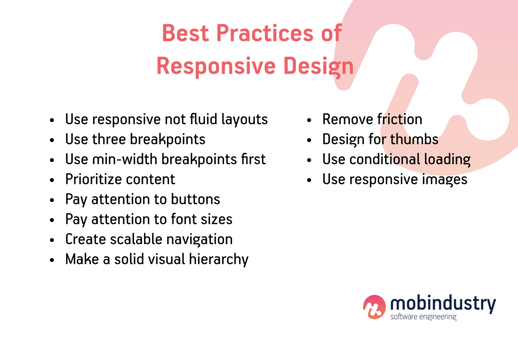
There are a few important things to keep in mind when preparing to design a responsive website. Here are responsive web design best practices.
Use responsive not fluid layouts
The terms responsive design and fluid design tend to be used interchangeably when it comes to mobile design, but they are not the same thing. Responsive design uses fixed pixel widths to define breakpoints at which user interface content adapts to zoom in or out. Fluid design uses percentages to automatically resize content depending on the screen it’s displayed on.
You might think responsive design sounds good, but you need to be careful with it. A responsive design can look odd depending on the size of the browser or device. For example, if the screen is too small, content may become cluttered or difficult to read. If the screen is too large, some elements may appear stretched or distorted.
Responsive design wins if you need a design that adapts to the best possible user experience or if you are designing for several different screens.
Use three breakpoints
Breakpoints are points in a website’s CSS that change the way content is displayed at different screen resolutions. They’re usually defined using the min-width and max-width values in responsive designs, which refer to the minimum or maximum width of pixels on the screen or for elements.
Most responsive websites need at least three or four breakpoints to function properly. Take any responsive website and resize it in your browser and you will see that the content adjusts as the size of the window changes. Breakpoints generally don’t work on mobile, tablet, and desktop, although you may have more breakpoints to cover all the basics for more device flexibility.
Use min-width breakpoints first
Every breakpoint you use in responsive web design has a minimum and maximum width. When designing with a mobile-first approach, which we recommend, it’s a good rule of thumb to start designing at the minimum width of your three control points.
This way, you’re designing screens for smaller devices and adding more content and UI elements as the screen gets larger. Remember: it’s always easier to scale up than down.
Prioritize content
Responsive design revolves around content. Assuming you’re adopting a mobile-first approach, you should prioritize important content for mobile and add more content as the screen size increases.
Responsive design prioritizes content. If you’re using a mobile-first approach, this means you should prioritize important mobile content and add more content as your screen grows.
Mobile users prefer short, simple interactions. This encourages them to search for more specific content. Hiding content and showing it as needed can help to create a seamless user experience. However, sometimes you just need to have certain content on a website, so using collapsible and expandable menus can work to your advantage.
Pay attention to buttons
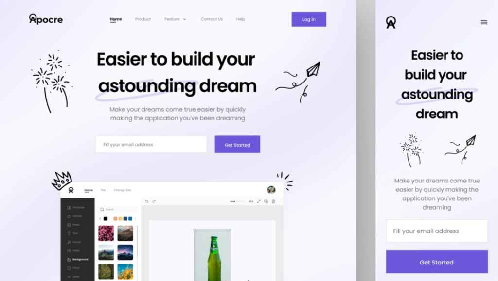
Button design is of the utmost importance when it comes to responsive design. A button can easily be clicked on the desktop, especially with a mouse. But what about when it comes to tablets and mobile phones? A finger isn’t as precise as a mouse.
Links and other interactive areas fall under this category as well. If the clickable area is too small, you might disappoint your users. Average finger taps are 44×44 pixels according to Apple’s Human Interface Guidelines. For greater usability, make sure your buttons and clickable areas are well-tuned to this average.
Pay attention to font sizes
Typography is the cornerstone of the internet and accounts for roughly 95% of all content. When choosing a font, make sure it works well on both large and small displays.
Tips:
- Use real text, not text within graphics. This way, the text can be enlarged without loss of quality.
- Make large headings responsive. Make your headlines legible, at least 1.6 times the text they support.
- Make the body copy responsive.
Create scalable navigation
Make sure navigation works on all types of devices. We recommend using the Priority + navigation pattern, as it ensures that settings with the highest priority are always visible to the user. Other options will be disclosed depending on their importance.
Make a solid visual hierarchy for all screen resolutions
Visual hierarchies are central to all types of devices. Some content needs to be seen first, some second, some third, and so on. Take a content inventory, prioritize content, and try to display the most important elements so users don’t have to scroll to find content.
Remove friction
A mobile-first approach to responsive web design will help designers assess what the user really needs to achieve their primary goal.
As we move on to the tablet version (and later to the desktop version), we can start thinking about secondary goals and microinteractions, user flows, and CTAs (calls to action) that make these custom goals achievable. More importantly, we should focus on the user’s primary goals first and eliminate any unnecessary friction that does not contribute to the achievement of the primary or secondary goals.
The primary goal might be to buy a product, while the secondary goal might be to sign up for a newsletter (which could lead to a purchase later).
Design for thumbs
Responsive web design is challenging in the sense that users will interact with a desktop website with clicks and with a mobile website with taps and swipes. There are also physical differences. Desktop users typically hold their computers on the surface, while mobile users hold their devices in their hands. These differences are fundamentally changing the way mobile user interface designers design touch objects and other critical user interface elements.
Thumbs can reach the center of the screen better than corners. (source: A List Apart)
Here are a few examples:
- People generally expect the main desktop navigation to be at the top; however, on mobile devices it should be at the bottom. Thumbs do not reach the top of the screen comfortably.
- Other interactive elements should also be easily accessible. This means they should be in the center of the screen, because it’s more difficult for users’ thumbs to reach the edges and corners of the screen.
- Critical links and CTAs must be at least 44 pixels high to be easy to tap (small touchscreens are detrimental to usability).
Use conditional loading
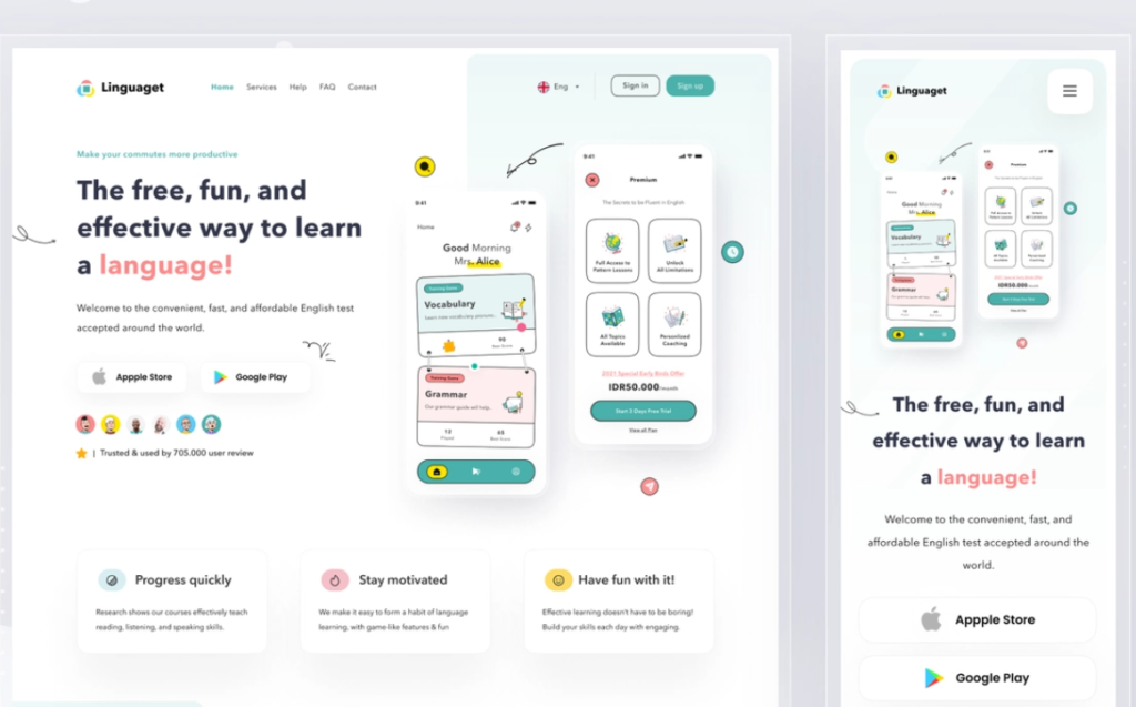
Some of the site’s elements are not intended for mobile users, or at least don’t require additional cognitive load. We want our mobile websites to be simple, so in certain scenarios, it makes sense to hide elements. We need to make sure we are not wasting browser resources and bandwidth by loading hidden items, however, so it’s best to only include hidden items under certain conditions.
A developer can achieve this through code; however, designers can improve page performance by communicating conditions when and where certain elements should and should not exist.
Use responsive images
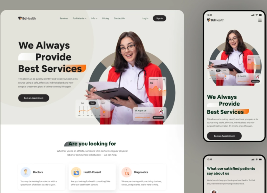
Some devices display more pixels per inch, which can result in blurry images if not exported at the correct resolution. Depending on the resolution, some devices will need images in double, triple, or even quadruple resolution. Web browsers now support the <picture> element, which selects the correct image resolution depending on the device.
Designers of responsive websites can adapt images to the device they want by exporting in all the resolutions used on modern devices (if you’re unsure, ask your developer).
Responsive design examples
Now let’s take a look at a few examples of responsive web design from different industries and find out what they do right.
New York Times
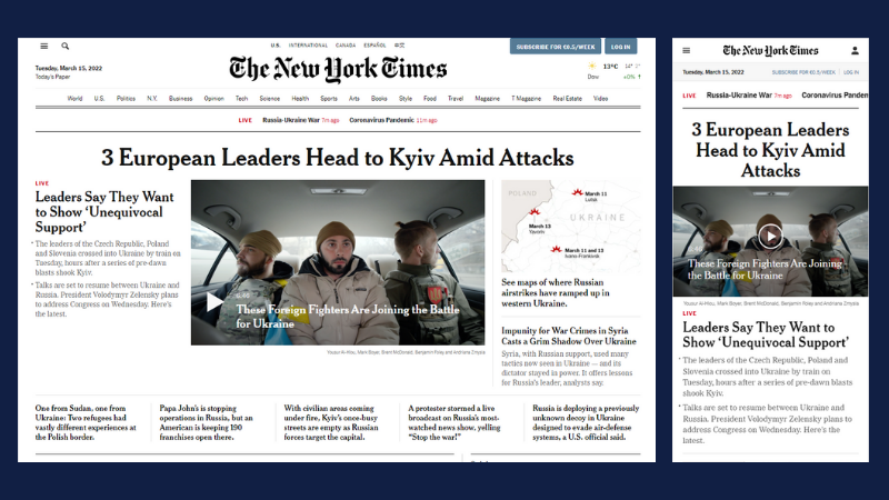
On the desktop version of the New York Times website, the layout reminds you of a traditional newspaper, replete with visuals and various rows and columns of content. There is a separate column or row for each news category. On mobile, the New York Times follows the single-column standard and adds a menu in accordion format for ease of use.
Amazon
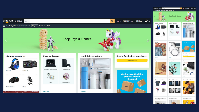
Amazon is the world leader in ecommerce because its user interface is perfect for all devices. The tablet layout simply removes some of the white space and adds a scrollable icon section to fit more content into a smaller package. The mobile layout narrows the site down to a single column, focusing on what matters most, such as recent purchases rather than the various section link icons on the desktop home page.
YouTube
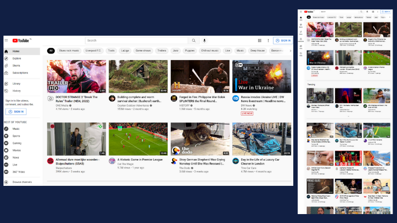
YouTube’s homepage design is based on a flexible grid of videos that are relevant to every user. On tablets, the number of columns in each row has been reduced to three. On mobile, it boils down to a one-column design. The mobile version also moves the main menu to the bottom of the screen, closer to the thumbs of smartphone users. This simple step improves navigation and the user experience.
Wired
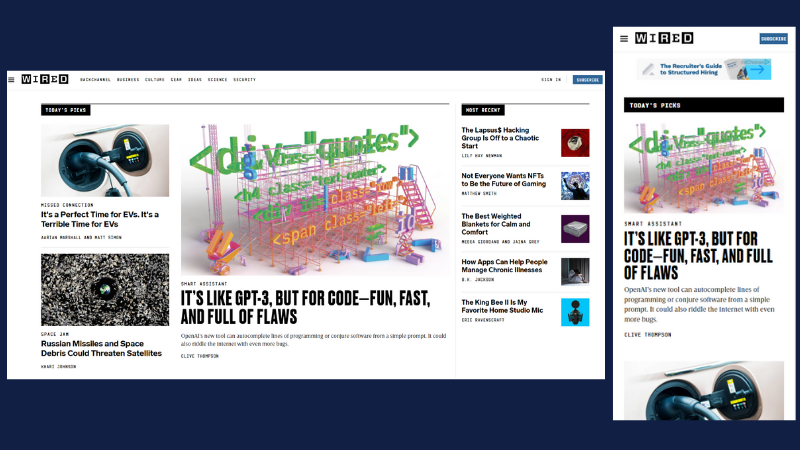
Wired’s approach to responsive web design focuses on implementing a one-column layout on all small screens, starting with tablets. This is a basic layout, but it makes it easier to draw users’ attention to top news stories and a call to action to subscribe.
Final thoughts
There are a lot of different elements that go into responsive web design. Without a basic understanding of HTML and CSS, it’s easy to make mistakes.
But by familiarizing yourself with the various building blocks, analyzing examples with web development tools, and testing sample code along the way, you can make your website responsive without any major issues.
Frequently Asked Questions
- Responsive layouts
- Media queries
- Flexible images and videos

